

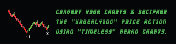
Problem Of Contrasting Elliott Wave Count
"Ambiguity" is nothing new in the realm of Elliott Wave Analysis.
If you give any 2 Elliott Wave traders the same set of charts.
Chances are, you will get 2 different opinions of the underlying price action.
Possibly, each with a valid Elliott Wave Count.
And both fulfilling the same set of rules & guidelines set down by R.N Elliott himself.
Research Based Remedy
In order to reduce the level of subjectivity in any Elliott Wave analysis we undertake.
A massive dose of "Due Diligence" is often required on the part of the trader performing the task.
Majority of traders understand and acknowledge that financial markets are "Fractal" in nature.
And with that in mind, we can expect one thing in our Elliott Wave analysis.
That is, the same set of Elliott Wave rules & guidelines will always be intact across all the different time frames.
Pulling Out All The Stops
Now, in order to clarify the Elliott Wave count, all the trader needs to do is to spare no efforts in his analysis.
"Drill" down into the underlying price action from the highest time frame right down to the lowest time frames.
Sounds simple enough, but in reality it is easier said than done.
Frankly speaking, unless you are a "Full-Time" trader where in-depth analysis comes naturally with the job scope.
How many "Part-Time" traders actually does the "Heavy Lifting" mentioned above for every single trade?
Charting Based Remedy
As far as I know, most true-blue Elliott Wave traders only use "Price Action" trading methodologies.
They only use pure price movements on the bare charts as the basis of their Elliott Wave analysis.
For myself, I am more of a "Hybrid" Elliott Wave technician.
First and foremost , price action is still "King" in my books, period.
But the King still needs "Troops" to help protect his kingdom right?
And having some form of technical indicators can sometimes be useful.
It helps traders to uncover the "Hidden" gems in the charts such as "Price Divergence".
However, in this case, I am not referring to the use of conventional technical indicators.
Nope, not talking about the common indicators like your moving averages, RSI or MACD.
In fact, the indicator I am applying to my charts actually removes the "Time" constraints of the underlying price action.
Figuratively speaking, it kind of conforms price into equal "Blocks" or "Chunks".
Timeless Based Charting
The standard "Time-Based" charts we are all familiar with has typically 2 axis with "Fixed" interval settings.
Namely "Price" on the vertical axis versus "Time" on the horizontal axis.
In a nutshell, with a "Timeless" based chart such as the Renko or the Range bar charts.
What we are effectively doing is taking away the "Time" element from the charts.
And focusing our attention on the price aspect irregardless of how long it took to reach certain price levels.
Renko Bar Charts
We will be using Renko Bar Charts for our explanation.
For those who are not familiar with Renko bar charts, here is the definition straight from the horse's mouth, Wikipedia.
There are in fact a few variations of Renko bar charting, ranging from Standard Renko, Hybrid Renko, Mean Renko, Flex Reno etc.
The main difference in comparison to the standard Renko bar charts is that you could have an offset of the open of the new Renko bar.
On standard Renko bar charts, the open is equal to the close of the prior bar.
This allows you to choose different configurations for trend continuation and trend reversal.
Now, the million dollar questions is how can Renko bar charting help traders like myself remove "Ambiguity" from our Elliott Wave Count?
Renko Bar Chart Example 1
Like the saying goes, "A Picture Is Worth A Thousand Words", let's dive straight into the charts.
I am personally using MetaTrader 4 as my main trading platform when it comes to trading the Forex markets.

Let's start our Elliott Wave Analysis on a lower time frame.
Using both the standard Price chart as well as Renko charts placed side by side for easier comparison.
The chart on the left is the standard time based chart using the 30min USDCHF chart as our example.
Each candlestick represents the price action that took place within the 30 min time frame including the highs and lows of the wicks.
Now, if you focus your attention on the Candlestick bars within the gray shaded box first.
Chances are, the first impression of an Elliott Wave Count is that it is some form of an "Impulsive" move followed by a "Corrective" structure.
Variable ATR Settings
However, if you examine the chart on the right using Renko bars with an 5% Daily ATR setting that closely mimics the underlying price action.
Instead of each bar representing a set time frame, we have totally taken "Time" out of the equation and focused mainly on price instead.
By using an ATR setting, the magnitude of each Renko bar is set to reflect a certain percentage of the Daily ATR of that particular Forex pair.
Now, do you notice that the Renko charts visually translates price action into the 1-2-3-4-5-a-b-c Elliott Wave sequence with an extended 3rd wave that most Elliott Wave traders are familiar with.
I have added in the labeling so that it is easier to identify the wave sequence.
Renko Bar Chart Example 2
Often, I have noticed that "Gaps" & "Long" wicks often impair and distort our analytical judgement and understanding of the underlying price action on the candlestick charts.
So in our next example, I have selected the 4Hr GBPUSD as the basis of our Elliott Wave Analysis.

The reason why I have selected this scenario is because of the presence of "Long Tail" wicks as seen on the Candlestick charts on the left, highlighted by the gray box.
Typically, we somewhat agree that it is some form of a "Corrective" structure.
Fine Tuning The ATR Settings
Now, by using using Renko bars with an 10% Daily ATR setting.
Don't you reckon that the corresponding chart on the right easily translates into the commonly recognizable 5-3-5 ABC Correction.
To me, my first impression is that it looks like a Zig Zag correction with an overlapping 5 wave "Leading Diagonal" for a Wave A.
Wave B looks pretty monotonous , which is typical.
And a 5 wave "Extended" Wave C?
Do you share the share opinion too?
Limitations Of Renko Charts
If you are somewhat convinced by the "Practical" functionality of Renko charting as a tool to removing "Ambiguity" from your Elliott Wave Counts, then great!
But please do not convert all your time based Candlestick charts into Renko charts just because of a few cherry picked examples.
Let me be straight with you, analyzing price action using Renko charts is somewhat "Useful".
But definitely cannot be perceived as "Holy Grail" that can totally eliminate subjectivity from all your Elliott Wave counts.
Trading using just Renko charts alone will mean that you will not have control over your "Time".
And might have to stay in front of the screen almost the entire day, certainly not something that I am looking forward to.
Conclusion
However, as an avid user of Renko charts since 2015.
I have found that my understanding of price action and subsequently my trading results has greatly improved by using a "Combination" of both Candlestick and Renko charting placed side by side on 2 monitors.
From experience, the ultimate "Trick" to effectively using Renko charts to remove subjectivity from your Elliott Wave count is to "Vary" the percentage ATR settings so that it closely mimics the underlying price action.
Like trying all things new, we need to trial and error before we can find that certain "Sweet" spot.
And with more screen time, I am pretty sure all aspiring Elliott Wave traders can appreciate the true power of Renko bar charting in unveiling the underlying price action.
Shorten your learning curve by downloading our complimentary Elliott Wave Cheat Sheets.
For more articles on the Elliott Wave Principle, check out our other posts in our Elliott Wave Blog.
Thanks for this great article. I was anticipating using renko charts to help me identify waves better and easier especially in situations with many gaps and long wicks. I have a question, please. Would you apply the fibonacci ratios on renko charts or you would rather go back to a candlestick chart to spot top and bottoms? Thanks in advance!!!
Hi Dragan,
I reckon the main advantage of using Renko Charts is to make it visually easier for traders to comprehend volatility like long wicks without going into the lower time frames.
However, I always use Renko chart side by side with candlestick charts for a more thorough understanding of the underlying Price Action.
As for the use of Fibonacci ratios, personally I prefer to use it on the Candlestick charts over the Renko charts as a long “Vertical” candlestick bar literally translates into a “Wide” cascading bar stairway that might potentially occupied a large portion of your screen space, making the Fibo measurements a tat hard to read.
Hope you get my drift on this.
As always trade safe and stay safe.
Cheers,
Derrick
Great article for a waver.
Thanks, glad you liked it.